

Maana + Nia — meaning “intention” in Swahili — is a sustainability-focused lifestyle brand founded on a decade-long journey of awareness, compassion, and connection. The brand aims to elevate everyday choices that create a gentler footprint for all beings, bringing together mindful consumers and businesses committed to a kinder world.
Intentional, sustainability-focused branding & website for a mission-driven lifestyle brand
Client
Services Provided
Branding & Logo
Website Build
Photography & Videography
Website Build
Photography & Videography
Results in Summary
Full brand identity from concept
Vibrant, purpose-driven visual system
Custom website launch
Vibrant, purpose-driven visual system
Custom website launch
The Goals & Challenges
Maana + Nia came to Odd Dog at the very beginning — not with an existing brand that needed a refresh, but with a deeply personal vision that needed to be brought to life for the first time. Founded by Sunil, whose years of living and traveling across Mumbai, New York, Toronto, Seattle, and beyond shaped his worldview, the brand was rooted in sustainability, compassion, and the belief that all beings are connected.
The challenge was translating something as abstract and philosophical as intentional living into a cohesive brand strategy & visual identity that could resonate across cultures and mediums. The branding needed to feel grounded and warm, yet bold enough to stand out in the crowded sustainability space. It also needed to honor the multicultural influences at the brand’s core — including nods to Swahili language and traditional African design — without losing approachability. And because Maana + Nia was building from scratch, the project required not just a logo, but a complete brand system: strategy, visual identity, typography, color palette, usage guidelines, and a fully built website to bring it all together.
From Our Clients
The team at Odd Dog have been great to collaborate with on my branding strategy and it's been awesome working with them on the early stages of my venture. Nothing is too small for them and they have approached my project with passion wanting to deeply understand my brand's mission and how best to bring it to life via their creative efforts.
See this review on Google → Sunil SanghaniMaana + Nia
Our Solutions
Rooted in Strategy
Before any design work began, our team invested in understanding the founder’s story, values, and long-term vision. We developed a brand strategy anchored in three core values — additive, simplistic, and intentional — and grounded to guide every creative decision from logo to launch.
A Visual Identity With Meaning
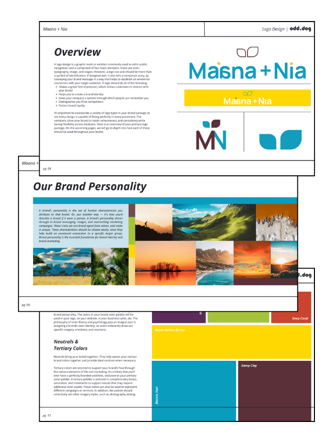
Our designer built a logo system rich with intentional symbolism. The primary logo features a fern motif representing resilience, while the reflected letterforms in “Maana” draw from traditional African typographic styles, evoking stillness and reflection. We paired these with a vibrant color palette chosen through careful color theory to evoke warmth, growth, and energy. The typography combines the modern clarity of Manrope with the handwritten softness of Edu QLD Beginner, balancing professionalism with a personal, human touch.
A Website to Match the Mission
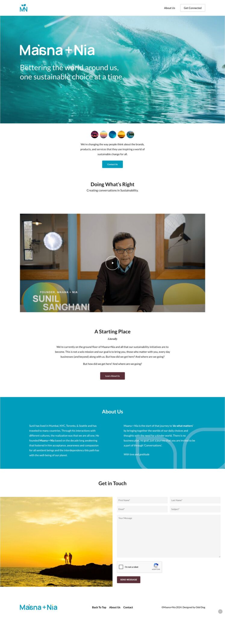
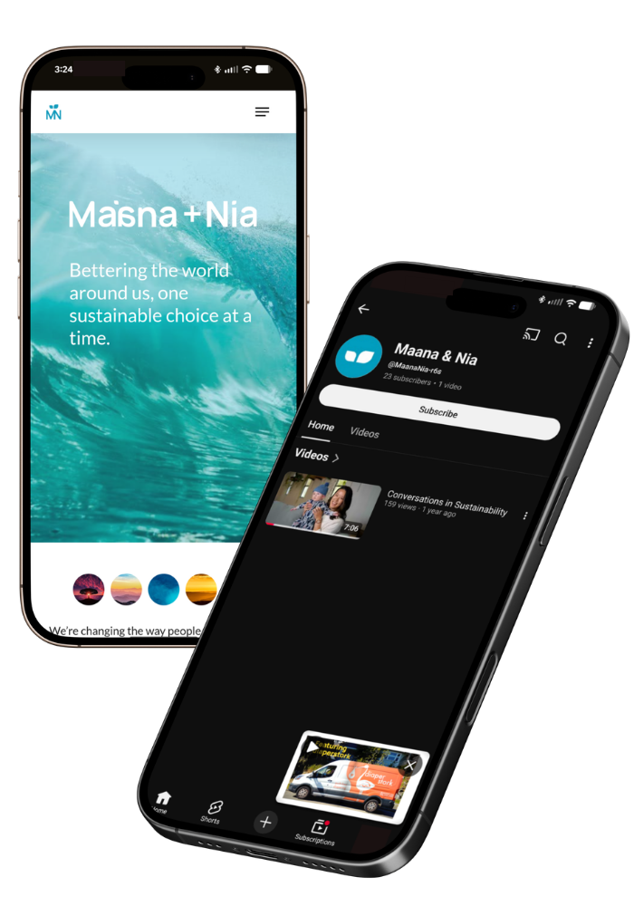
Using the new brand system as its foundation, we built a custom website designed to introduce visitors to Maana + Nia’s story and invite them into the journey. The site features video integration, clear calls to action, and a design language that carries the brand’s visual identity seamlessly from the guide to the screen.
The Results
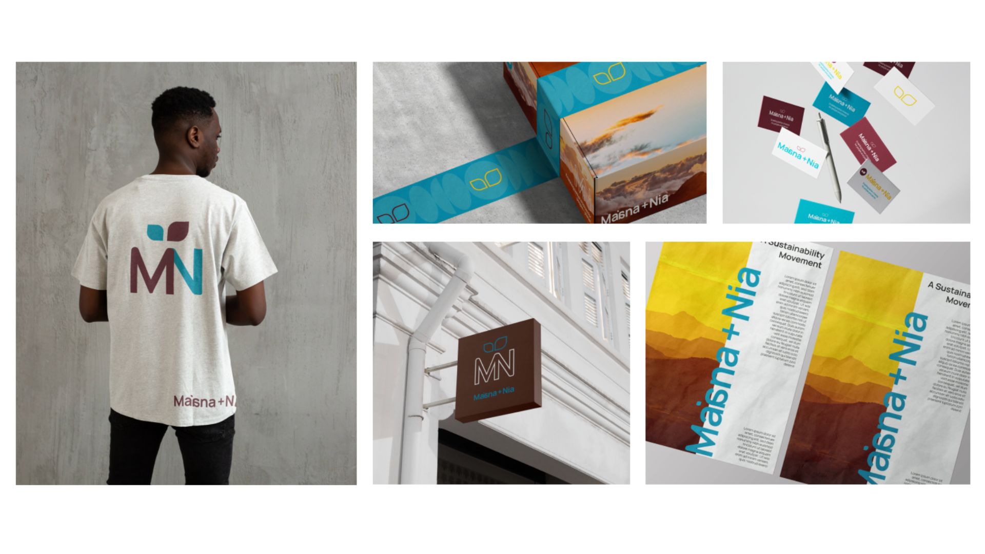
Powerful branding tells a story, and the Maana + Nia brand tells a deeply personal one. Our team delivered a comprehensive 22-page brand guide covering brand strategy, logo architecture with primary, secondary, and tertiary mark variations, a full color system with primary and tertiary palettes, typography standards, usage and misuse guidelines, photo treatments, and brand-in-use mockups.
The result is a visual identity that honors the brand’s multicultural roots and sustainability mission while remaining clean, modern, and versatile. From the intentional fern detail in the logo’s letterforms to the bold warmth of the color palette, every element was designed to reflect the brand’s guiding philosophy: that even small, intentional choices can change the world.
With the brand guide complete, we carried that identity into a fully custom website at maanaandnia.com — giving Maana + Nia a digital home that reflects the same care and purpose that drives its mission.
We are a full-service digital marketing agency.
See All ServicesHave a project in mind?
Don’t make your customers dig to find your business.
Unleash the power of digital marketing.
Unleash the power of digital marketing.